Managing Control Charts
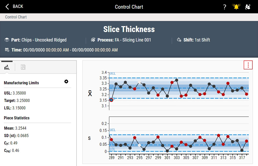
The Control Chart is a graphical display of a feature that has been measured or computed from a sample versus the sample number or time. Once you set control limits, the chart contains a center line that represents the mean or average value of the quality characteristic corresponding to the in-control state. The top line is the upper control limit (UCL) and the bottom line is the lower control limit (LCL). If nearly all of the sample points fall between the control limits (UCL and LCL), you can consider the process to be in-control.
Enact stores the Control Chart options for individual users. If you make changes to the Control Chart options and you return later, Enact remembers and displays the changes for you. If another user makes changes to the Control Chart options and that user returns later, Enact remembers and displays the changes for that user.
-
Variable control charts track features that can be measured on a continuous scale and generate both the mean and variability, leading to more efficient control feedback and providing more information about process performance than Attribute Control Charts.
-
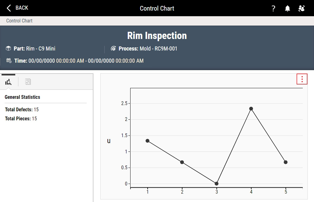
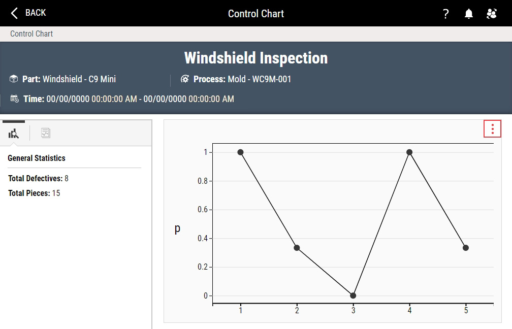
Attribute control charts normalize the values to the subgroup size rather than plotting the raw number of defects or defectives found, as follows:
-
Defects. Using a u chart, Enact plots the ratio of defects to the subgroup size for each subgroup.
-
Defectives. Using a p chart, Enact plots the ratio of defectives to the subgroup size for each subgroup.
-
-
In the Control Chart, you can do the following:
- Managing Data View Charts
-
 Examining Control Chart Header
Using this procedure, you will examine the Control Chart header.
-
Examine the Control Chart header.

-
In the Control Chart header, review the following data about the Control Chart:
- Feature. Feature in the Control Chart.
- Units. Unit type in the Control Chart (for example, mm).
- Part. Part in the Control Chart.
- Process. Process in the Control Chart.
- Shift. Shift in the Control Chart.
- Lot. Lot in the Control Chart.
-
-
Viewing Statistics Information
Using this procedure, you will examine summarized data about the Control Chart.
-
If necessary, select Statistics Information in the upper left hand corner of the Statistics Information panel.
-
In the Statistics Information panel, you can examine summarized data about the Control Chart.
(Variable Control Charts only) To display a missing statistic, do the following:
-
In the Statistics Information panel, select Statistic Settings.
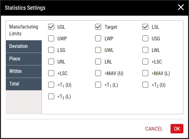
- In the Statistics Settings dialog box, select the desired tab, select the desired statistic, and then select OK.
Variable Control Charts
-
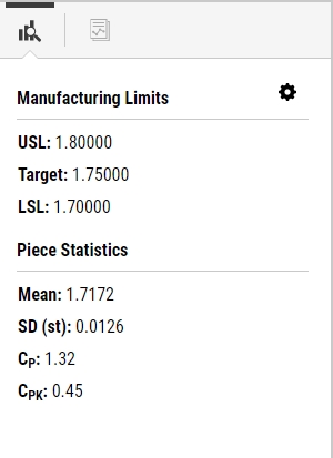
Manufacturing Limits
- USL. (Default selection) Upper specification limit.
- Tar. (Default selection) Target limit.
- LSL. (Default selection) Lower specification limit.
- UWP. Upper within-piece limit.
- LWP. Lower within-piece limit.
- USG. Upper subgroup limit.
- LSG. Lower subgroup limit.
- UWL. Upper warning limit.
- LWL. Lower warning limit.
- URL. Upper reasonable limit.
- LRL. Lower reasonable limit.
- >LSC. Percent of measured values that fell above the Label Stated Content.
- <LSC. Percent of measured values that fell below the Label Stated Content.
- >MAV (U). Percent of measured values that fell above the Maximum Allowable Variation Upper.
- <MAV (L). Percent of measured values that fell below the Maximum Allowable Variation Lower.
- >T1 (U). Percent of measured values that fell above the T1 Upper.
- <T1 (L). Percent of measured values that fell below the T1 Lower.
- >T2 (U). Percent of measured values that fell above the T2 Upper.
- <T2 (L). Percent of measured values that fell below the T2 Lower.
-
Deviation
- LSC. Label Stated Content, which is the volume/weight label typically found on food items.
- LSC (%). Percent of measured values that fell above or below the Label Stated Content.
- Spec. Dataset's Mean minus the Specification Limit Target value.
- PM. Dataset's Mean minus the Control Limit Process Mean.
-
Piece
-
Mean. Arithmetic average of a given data set, where N represents the number of values in the data set.
Formula -
SD (st). Short-term process variation estimated from either the within-subgroup standard deviation (for n > 1) or moving standard deviation (for n = 1) of the subgroups.
Formula -
SD (lt). Variation representing the average deviation of values from their mean, often called the RMS (root mean square) method of calculating sigma.
Formula -
Cp. Capability ratio using short-term standard deviation, comparing the specification limit spread to the spread of the variation of the data stream.
Formula -
Cpk. Capability ratio that is adjusted for non-centered processes, using short-term standard deviation, comparing the specification limit spread to the spread of the variation of the data stream. Cpk is equal to the smaller of Cpu or Cpl.
Formula -
Pp. Ratio of the process variability (six sigma) with the width of the specification limits (total tolerance). The standard deviation (sigma) is calculated using the root mean square method (RMS).
Formula -
Ppk. Capability ratio that is adjusted for non-centered processes, using long-term standard deviation, comparing the specification limit spread to the spread of the variation of the data stream. Ppk is equal to the smaller of Ppu or Ppl.
Formula
-
-
Within
-
SD (st). Short-term process variation estimated from either the within-subgroup standard deviation (for n > 1) or moving standard deviation (for n = 1) of the subgroups.
Formula -
SD (lt). Variation representing the average deviation of values from their mean, often called the RMS (root mean square) method of calculating sigma.
Formula -
Cp. Capability ratio using short-term standard deviation, comparing the specification limit spread to the spread of the variation of the data stream.
Formula -
Cpk. Capability ratio that is adjusted for non-centered processes, using short-term standard deviation, comparing the specification limit spread to the spread of the variation of the data stream. Cpk is equal to the smaller of Cpu or Cpl.
Formula -
Pp. Ratio of the process variability (six sigma) with the width of the specification limits (total tolerance). The standard deviation (sigma) is calculated using the root mean square method (RMS).
Formula -
Ppk. Capability ratio that is adjusted for non-centered processes, using long-term standard deviation, comparing the specification limit spread to the spread of the variation of the data stream. Ppk is equal to the smaller of Ppu or Ppl.
Formula
-
-
Total
-
SD (st). Short-term process variation estimated from either the within-subgroup standard deviation (for n > 1) or moving standard deviation (for n = 1) of the subgroups.
Formula -
SD (lt). Variation representing the average deviation of values from their mean, often called the RMS (root mean square) method of calculating sigma.
Formula -
Cp. Capability ratio using short-term standard deviation, comparing the specification limit spread to the spread of the variation of the data stream.
Formula -
Cpk. Capability ratio that is adjusted for non-centered processes, using short-term standard deviation, comparing the specification limit spread to the spread of the variation of the data stream. Cpk is equal to the smaller of Cpu or Cpl.
Formula -
Pp. Ratio of the process variability (six sigma) with the width of the specification limits (total tolerance). The standard deviation (sigma) is calculated using the root mean square method (RMS).
Formula -
Ppk. Capability ratio that is adjusted for non-centered processes, using long-term standard deviation, comparing the specification limit spread to the spread of the variation of the data stream. Ppk is equal to the smaller of Ppu or Ppl.
Formula
-
Attribute Control Charts
-
General Statistics
- Total Defects / Total Defectives. Total number of defects or defectives across all the subgroups.
- Total Pieces. Total number of pieces across all the subgroups.
-
-
-
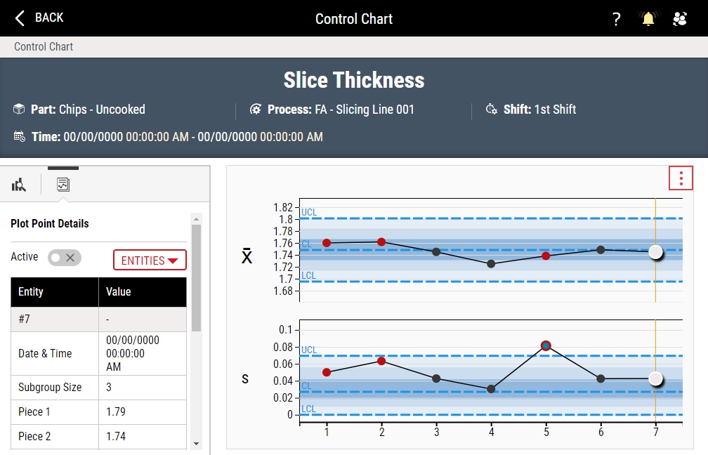
Viewing Plot Point Details
Using this procedure, you will examine the details about a selected subgroup plot point on the Control Chart.
Based on color and design, you can identify the status of the plot points on your control charts, as follows:
-
 Normal plot point.
 -
 Out of specification (OOS) plot point.
 -
 Out of control (OOC) plot point.
 -
 Out of specification and out of control plot point.
 -
 Inactive plot point. For more information, please see Disabling Subgroups.
-
In the Control Chart, select the plot point for the desired subgroup.
After selecting a plot point, you can always select Plot Point Details to reopen the Plot Point Details panel.

-
In the Plot Point Details panel, you can examine the details about a selected subgroup plot point on the Control Chart.
To display a missing detail, do the following:
-
In the Plot Point Details panel, select Entities.
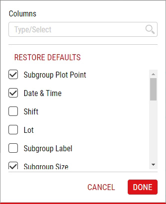
-
In the Entities dialog box, select the desired detail and then select Done. To restore the details selections to the default settings, select Restore Defaults.
-
Available Details
- Subgroup Plot Point. (Variable Control Charts only) Subgroup plot point number.
- Date & Time. Date and time stamp for selected subgroup.
- Shift. Defined daily schedule during which the subgroup collection occurred.
- Lot. Quantity of manufactured items regarded as a group or batch, typically identified with an alphanumeric code.
- Subgroup Label. Textual information about the selected subgroup added during data collection.
- Subgroup Size. Total number of pieces within the subgroup.
-
Raw Data. (Variable Control Charts only) Collected value for each subgroup piece in sequential order (for example, Piece 1, Piece 2, Piece 3, etc.).
- Plot Point Value. (Variable Control Charts only) XBar and range values.
-
Defects/Defectives. (Attribute Control Charts only) Total number of defects or defectives in the selected subgroup.
To view a list of the selected defects or defectives, select the count in the Defects/Defectives data field.
- u. (Attribute Defects Control Charts only) Ratio of defects to the subgroup size for each subgroup.
- p. (Attribute Defectives Control Charts only) Ratio of defectives to the subgroup size for each subgroup.
- Feature. Feature in the Control Chart.
- Part. Part in the Control Chart.
- Process. Process in the Control Chart.
- Unit Of Measurement. (Variable Control Charts only) Unit type in the Control Chart (for example, mm).
- Specification Limits. (Variable Control Charts only) Upper specification limit and lower specification limit.
- Target. (Variable Control Charts only) Target limit.
- Within Piece Limits. (Variable Control Charts only) Upper within-piece limit and lower within-piece limit.
- Subgroup Limits. (Variable Control Charts only) Upper subgroup limit and lower subgroup limit.
- Warning Limits. (Variable Control Charts only) Upper warning limit and lower warning limit.
- Reasonable Limits. (Variable Control Charts only) Upper reasonable limit and lower reasonable limit.
- NCC Limits. (Variable Control Charts only) T1 upper limit, T1 lower limit, T2 upper limit, T2 lower limit, MAV upper limit, and MAV lower limit.
- Control Limits. XBar upper control limit, XBar centerline, XBar lower control limit, range upper control limit, range centerline, and range lower control limit.
-
-
-
Disabling Subgroups
By disabling subgroups, you remove the subgroup values from the calculated control limit values and other statistics, like the Cp/Cpk calculations.
-
In the Control Chart, select the plot point for the desired subgroup.
-
In the Plot Point Details panel, deactivate the Active slider.
-
- Select Back.


