Managing Bubble Charts
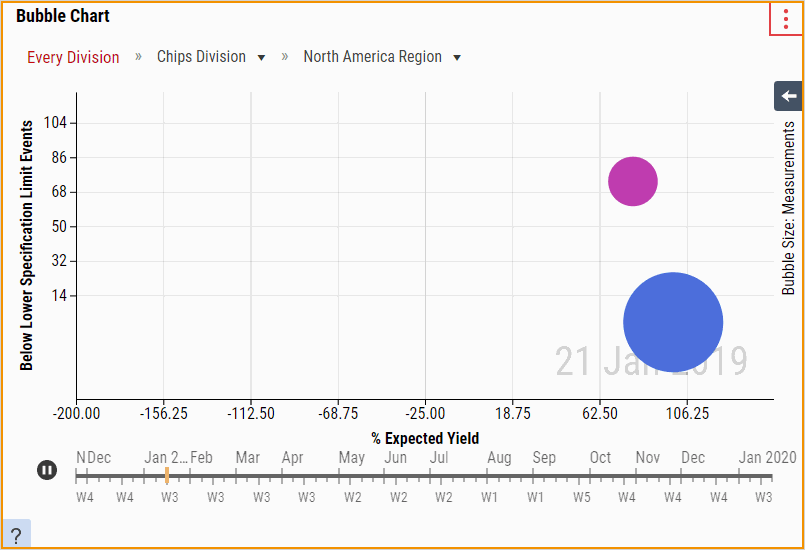
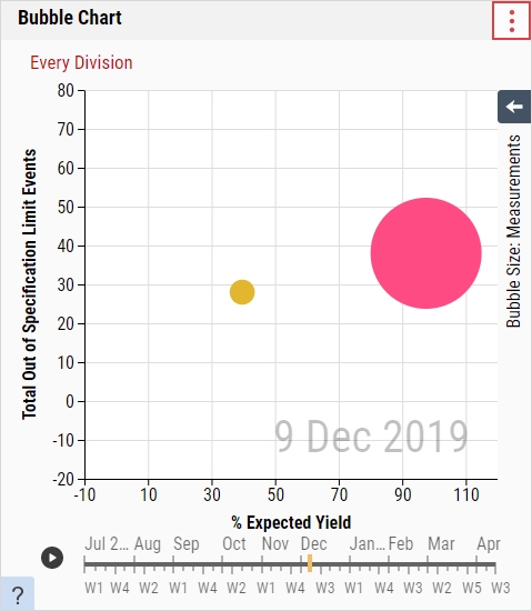
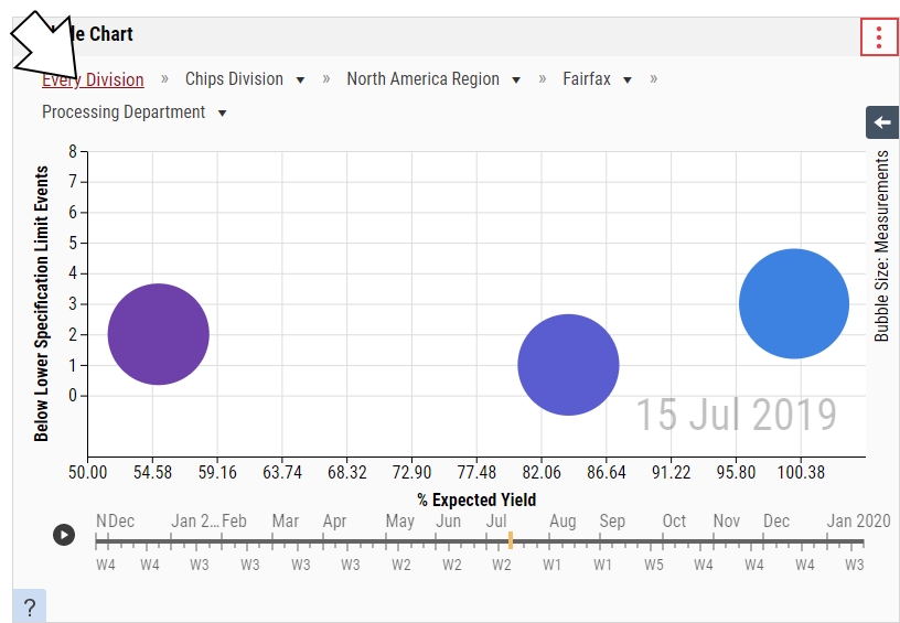
The Bubble Chart tile displays three statistics for each process branch in the parameter set, summarized at a particular hierarchy level (for example, division, region, site, etc.) and plotted as a disk that expresses the values through the disk's X-Axis Statistic and Y-Axis Statistic (both required), and the disk's size (optional). Each bubble is a summary of all the processes underneath the top-level process, which is set in the Initial Grouping data field (for example, a Division-level bubble represents a summary of all processes within that division). By selecting a bubble on the Bubble Chart, you can drill down into child processes, starting at the top-level (Division by default, though it depends on the Initial Grouping configuration), and through level 10 of the process hierarchy.
When you select the parameter set on the dashboard, it will affect the contents of this tile.
-
In the aggregated dashboard toolbar, select Add Tile and then select the Bubble Chart tile.
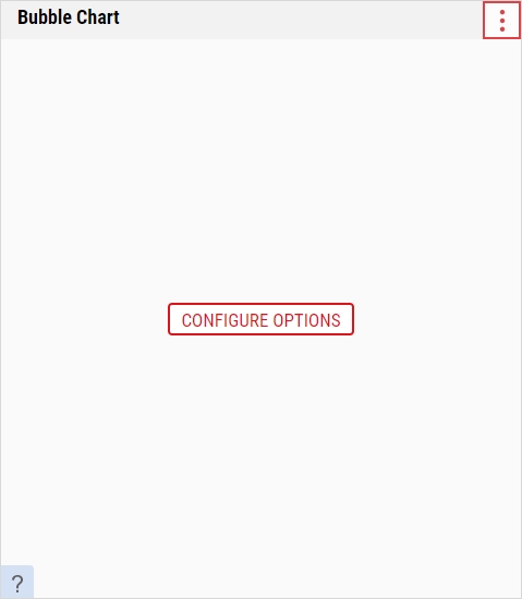
When you add the Bubble Chart tile for the first time, you must configure the tile before doing anything else. Please select Configure Options, and then follow the instructions below.
-
In the Bubble Chart tile, you can do the following:
- Selecting Parameter Sets
-
 Configuring Options
Using this procedure, you will configure your Bubble Chart options.
Enact stores the Bubble Chart options for individual users. If you make changes to the Bubble Chart options and you return later, Enact remembers and displays the changes for you. If another user makes changes to the Bubble Chart options and that user returns later, Enact remembers and displays the changes for that user.
-
In the Bubble Chart tile, select More and then select Configure Options.
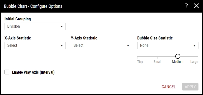
- In the Initial Grouping drop-down list, select the desired top-level process hierarchy level. When you open the aggregated dashboard, Enact displays this process hierarchy level.
-
In the X-Axis Statistic drop-down list, select the desired statistic type and then select the desired statistic.
Available Statistics
-
Sampling Compliance (All Checks, Data Collections, Checklist Collections)
- % Completed. Percentage of checks that were completed in time or late.
- % On-Time. Percentage of checks that were completed in time.
- % Late. Percentage of checks that were completed late.
- % Missed. Percentage of checks that were not completed.
-
Yield
- % Expected Yield. Percent of expected yield accounting for off-centeredness and long-term standard deviation.
- % Measured Yield. Percent ratio of measurements in specification to total number of measurements.
-
Events
- # OOS. Number of events caused by measured values outside the specification limits.
- # >USL. Number of events caused by measured values above the upper specification limit.
- # <LSL. Number of events caused by measured values below the lower specification limit.
- # NCC. Number of events caused by measured values outside the net content control limits.
- # >T2 (U). Number of events caused by measured values above the T2 Upper.
- # <T2 (L). Number of events caused by measured values below the T2 Lower.
- # >MAV (U). Number of events caused by measured values above the Maximum Allowable Variation Upper.
- # <MAV (L). Number of events caused by measured values below the Maximum Allowable Variation Lower.
-
-
In the Y-Axis Statistic drop-down list, select the desired statistic type and then select the desired statistic.
Available Statistics
-
Sampling Compliance (All Checks, Data Collections, Checklist Collections)
- % Completed. Percentage of checks that were completed in time or late.
- % On-Time. Percentage of checks that were completed in time.
- % Late. Percentage of checks that were completed late.
- % Missed. Percentage of checks that were not completed.
-
Yield
- % Expected Yield. Percent of expected yield accounting for off-centeredness and long-term standard deviation.
- % Measured Yield. Percent ratio of measurements in specification to total number of measurements.
-
Events
- # OOS. Number of events caused by measured values outside the specification limits.
- # >USL. Number of events caused by measured values above the upper specification limit.
- # <LSL. Number of events caused by measured values below the lower specification limit.
- # NCC. Number of events caused by measured values outside the net content control limits.
- # >T2 (U). Number of events caused by measured values above the T2 Upper.
- # <T2 (L). Number of events caused by measured values below the T2 Lower.
- # >MAV (U). Number of events caused by measured values above the Maximum Allowable Variation Upper.
- # <MAV (L). Number of events caused by measured values below the Maximum Allowable Variation Lower.
-
-
In the Bubble Size Statistic drop-down list, select the desired statistic.
- None. Disable the bubble size statistic, and then select and drag the slider to the desired static bubble size (Tiny, Small, Medium, or Large). Enact will display all bubbles at the selected size.
- Measurements. Number of measurements taken.
- To add a scrollable timeline to show how statistics change over the course of time, select Enable Play Axis (Interval), and then select the desired interval (Days, Weeks, or Months). If you do not select Enable Play Axis (Interval), Enact displays all data within the parameter set.
- When finished, select Apply.
-
-
Viewing Bubble Size
Using this procedure, you will open the bubble size panel to identify the significance of the bubble sizes, with the largest bubble size set to the largest bubble on your chart and the middle bubble size set to one half of the largest bubble size.
- In the Bubble Chart, select Panel Open.
-
In the Bubble Size panel, examine the different bubble sizes.
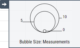
- When finished, select Panel Close.
-
Navigating Bubble Charts
Using this procedure, you will navigate through the process hierarchy, drilling down into child processes or move up to a parent process, which is set in the Initial Grouping data field.
-
To drill down into child processes, select the desired bubble, and in the process identification dialog box, select Select.
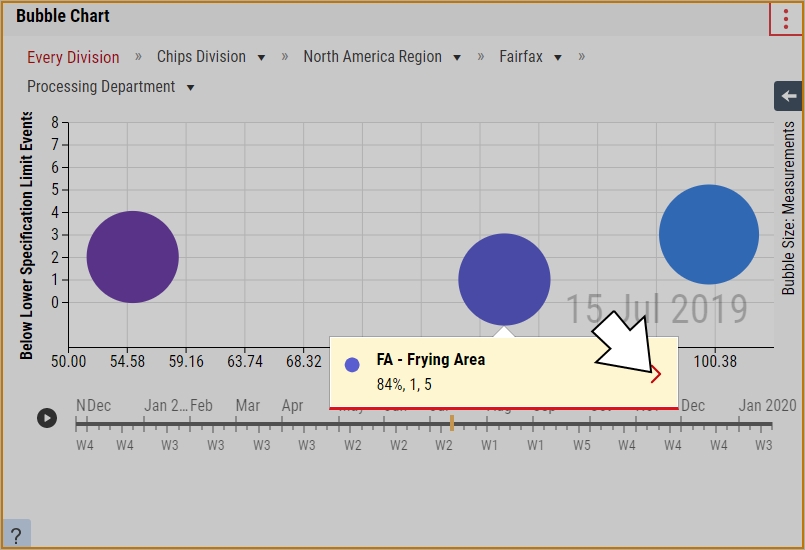
In the selected process dialog box, Enact displays the comma delimited values for the X-Axis statistic, Y-Axis statistic, and Bubble Size statistic.
-
To move up to a parent process, select the desired parent process in the Bubble Chart breadcrumb navigation.
If a parent process contains multiple child processes, select the drop-down list and then select the desired child process.
-
-
Playing Timeline
Using this procedure, you will play a scrollable timeline to show how statistics change over the course of time.
-
Removing Tiles
Using this procedure, you will remove the Bubble Chart.
-
In the unlocked dashboard, locate the Bubble Chart.
For more information, please see Locking/Unlocking Dashboards.
- In the Bubble Chart, select More and then select Remove Tile.
- Select Save.
-